
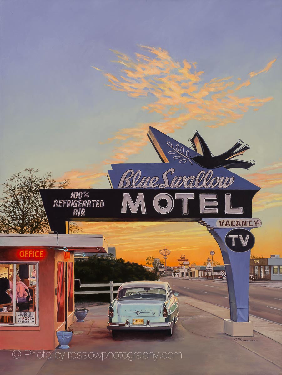
Color Accuracy in Artwork Photography
Most people don’t think about color accuracy until they see it go wrong: a print that comes back purple instead of deep red, or a competition photo where a nocturne looks like mud instead of the painting that’s actually hanging on the wall. In artwork photography, color isn’t a finishing touch. It’s the whole job.
A Camera Doesn’t Know It’s Looking at a Painting
Modern cameras and phones “solve” for scenes (landscapes, sunsets, faces) using processing built around millions of ordinary photographs. A painting isn’t really in that training set. So the camera makes assumptions that fit a sunset and fights the actual pigment: it darkens shadows that were painted intentionally dark, shifts warm oils cooler to hit a “neutral” white balance, and flattens a delicate glaze into a single block of color. None of that is a hardware flaw. It’s an interpretation problem. The camera is guessing at a pleasing photo, when what’s needed is a faithful one.
Pigment Behaves Differently Than a Scene
A few things make paintings genuinely harder to color-correct than an ordinary photo subject:
- The same pigment can read as a different color under different light sources, a physical property of the pigment, not a camera setting.
- Transparent glazes shift depending on what’s underneath them and the angle of the light hitting them.
- Dark passages often hold real detail that a “properly exposed” photo will crush to black.
- Gold leaf and iridescent paint work by directing reflections rather than diffusing light the way a matte surface does. Getting them right sometimes means adding specific light modifiers to place a reflection exactly where it needs to be for the effect to read the way the artist intended.
None of these are exotic edge cases for a working artwork photographer. They’re just Tuesday.
The Colors That Cause the Most Trouble
Some colors are more prone to shifting than others. Reds, oranges, and yellow-greens are the ones I watch most closely: they’re the first to drift under a camera’s processing, and correcting them usually means moving their hue, saturation, and luminance independently until they sit back where they belong, not just nudging the overall brightness or warmth of the file. Browns cause a different problem: straight out of the camera they often render oversaturated, with a waxy intensity that isn’t actually in the paint. Calming them back down takes a targeted fix, not a global filter.
What “Color Accurate” Actually Means
Accurate isn’t the same as pleasing. An accurate file matches the pigment relationships in the original, whether or not that happens to look more vivid or more muted than someone might expect. That distinction matters most when the stakes are real: a competition juror should be evaluating the painting you made, not a slightly-enhanced version of it. A collector who orders a print should get back the painting they were shown, not a reinterpretation of it.
Matching the Artist’s Intent, Not Just the Paint
A painting is not a photograph of reality. It’s an interpretation of it, and the artist has already made choices about what to emphasize, exaggerate, or quiet down. After photographing thousands of paintings for hundreds of artists, I’ve learned to recognize those choices, not just the colors on the canvas. A landscape painter will often push the contrast in a cloud formation well past what a camera would ever record from the sky itself, because that’s the drama they’re building into the piece. My job isn’t to correct that back toward a flat, photographically “accurate” sky. It’s to preserve the effect the artist was reaching for.
The same is true of an intentional color cast: a warm overtone laid over a whole piece, or a smoky, neon-lit mood built into a bar scene. A phone will try to “fix” that, correcting the tint and color temperature back toward neutral and erasing the exact mood the artist built in. Recognizing which color shifts are mistakes to correct and which ones are the artist’s voice takes more than a trained eye. It takes some heart for what the artist is trying to say.
A Background Most Photographers Don’t Have
Before photographing paintings for a living, I worked professionally as a color separator in the commercial print industry, where color accuracy was a contractual standard, not an aesthetic preference. That work built a practical understanding of pigment chemistry and how different mediums, oil, watercolor, pastel, respond to light differently. I’m also a trained artist myself, with a Bachelor of Science in art and time spent studying landscape painting under Joe Paquet, which gives me a working sense of what a painter is trying to achieve with a particular passage of color, not just what pixels happen to be there. My color vision has also been independently verified as perfect, through a clinical assessment rather than the standard dot test. That’s a meaningful credential for color-critical work, not a marketing claim.
The Standard: Faithful to the Painting and the Painter
Every file I deliver is corrected toward what your painting actually is and what you were trying to do with it, not toward what a camera algorithm guesses might look better. That’s the deliverable: an accurate, faithful record of the artwork you can use with confidence for competitions, print reproduction, gallery submissions, and your own archive.
Color correction is only half the process. For the camera and lens that capture the file in the first place, see How I Photograph Paintings.
See Pricing & What’s Included →
*Road Trip by Kevin Komadina